Modigliani and Picasso had a bipolar relationship. In some points during the film Picasso and Modigliani hated each other. Let me rephrase that, in most points during the film Picasso and Modigliani seemed to hate each other. However, we, as viewers, got to see the friendly, lighter side of their relationship that none of the characters in the film got to bare witness to. There were two specific scenes that showed the friendly relations between Modigliani and Picasso. The first was when Picasso took Modigliani to see Monet and the other scene being when they shared a car ride together and mocked each other. There was definitely more tension and rivalry in their relationship rather than fun as shown by the dramatic stare downs and scuffles between the two artists throughout the movie.
From an artistic standpoint, even though both artists were always competing against each other and critiquing each others work in the end I think they both respected each others work. It's tough to see this especially when Picasso paints over one of Modigliani's works, but I think towards the end of the movie when Modigliani's piece is unveiled and even Picasso marvels over it you can truly see the respect they have for one another. Also, I don't think Picasso would have uttered Modigliani's name on his death bed if he did not respect him, or at least recognize his work was the bane of his existence.
Since I do not know the specifics on the actual Modigliani and Picasso relationship it's hard to say how accurate Hollywood's version of the story really is, but it was an entertaining interpretation of the story of the two artists whether it was truly that dynamic or not.
Monday, May 31, 2010
Tuesday, May 25, 2010
Final Blog Assignment
Like the book said practices of looking have been used as central discriminatory systems in science. The identification of the visible and measurable differences have been means through which stereotypes have been carried out. The book also made a point that the establishment of genetic difference is just a new way of justifying discriminatory social practices and eliminating social programs because the people are genetically predispositioned to what they are going to do so there is no need in helping them. I think that type of thinking is, for lack of a better term, BS. I actually do believe that genetically people are more prone to do certain things, do certain things, etc, however I don't believe that means we shouldn't do anything as a society to help them in their lives.
"Human Race Machine allows us to move beyond difference and arrive at sameness."
This statements is pretty self explanatory. Her project is intended to allow people to see that all people are the same and move beyond racism.
Unfortunately my book is the previous edition to the book we're supposed to have so it did not talk about the 'Human Race Machine', but it did talk about Nancy Burson's contributions to science through art. I did a little outside research on the topic so I could give a somewhat informed answer to the question at hand about the validity of Burson's idea that race is not genetic.
I think Burson's intention behind the project is awesome. Racism should be thrown out the window and everyone should be loved and treated equally. However, I think her statement that race is social and not genetic is false. I think it is controlled by genetics and environment. Race is commonly defined as any combination of various physical characteristics, as skin color, facial form, or eye shape. She could have a different definition, but for the basis of my argument that's the definition I'm using for race. Every physical trait is controlled by genetics, which may have been affected by environment over long periods of time. Certain racial groups have certain 'looks' because of these genetics, which includes skin pigmentation. Recognizing that certain racial groups look different is not racist in my opinion, it's when you exploit the differences in a negative manner where it gets unethical. I'm not sure how someone's race could be effected by society. If a white male of European descent hung out in Beijing from birth he would not look Asian. He would certainly adopt their customs, but he physically would not adopt their race. I think what Burson is trying to spread is that every race is just as intelligent and the same as anyone else, which I agree with.
Thursday, May 13, 2010

Original

Photoshopped
This is the front page of the Spring issue of the 2010 Victoria Secret magazine. The original ad depicts a Victoria Secret model sitting seductively on what looks to be a beach. I'm sure the beach setting is added for aesthetic appeal. The ad has text that reads 'spring sale & special' across the bottom and highlights the special deals in the magazine on the right side. The technical meaning of the ad is to inform the reader of the clothing deals in the issue so they will buy clothing from Victoria Secret. The hidden meaning (which really isn't that hidden) is the sexual intent behind the ad. The model is posed in a very seductive fashion with fairly skimpy clothing on. The ad appeals to both men and women because it convinces women that by buying Victoria Secret clothing they can achieve the 'look' of the pictured model. The ad appeals to men because they see the model as a sexual figure. At first, you may think men would not play a huge role in the Victoria Secret clothing scene, but they can. When women who are potential buyers of Victoria Secret see the reaction males have to this particular ad (generally a positive male reaction) they want to look like the model and therefore buy Victoria Secret clothes. In light of that explanation, the ad effectively reaches a fairly large demographic of people ranging from men to women but mostly women. I'm sure of the women who are targeted it is mostly young women who shop at Victoria Secret because of the models in the magazine, however, older women (by older I mean 30s and 40s) are targeted by the ad as well. I think the makers are trying to draw in the consumer who wants to look good and pretty, which I'd say is safe to say every girl. With this particular ad the model is caucasian, young, beautiful and probably wealthy. I think there is definitely a bit of classiness and nobility that is also being sold through the ad that one may be able to achieve by wearing their products. However, I don't believe this particular model's race plays much of an issue because of the diversity of the rest of the models. The ad seems to be promoting a relaxed casual but sexy lifestyle. I personally think the ad is extremely effective and appealing. Obviously, I would never buy any clothing from Victoria Secret, but I may tell my girlfriend how attractive Victoria Secret models are, which in turn may cause her to go out and buy their clothes. In conclusion, I believe the ad is selling more than just clothes, but also the sexuality and the belief that one can attain such sexuality by wearing their clothes.

Original
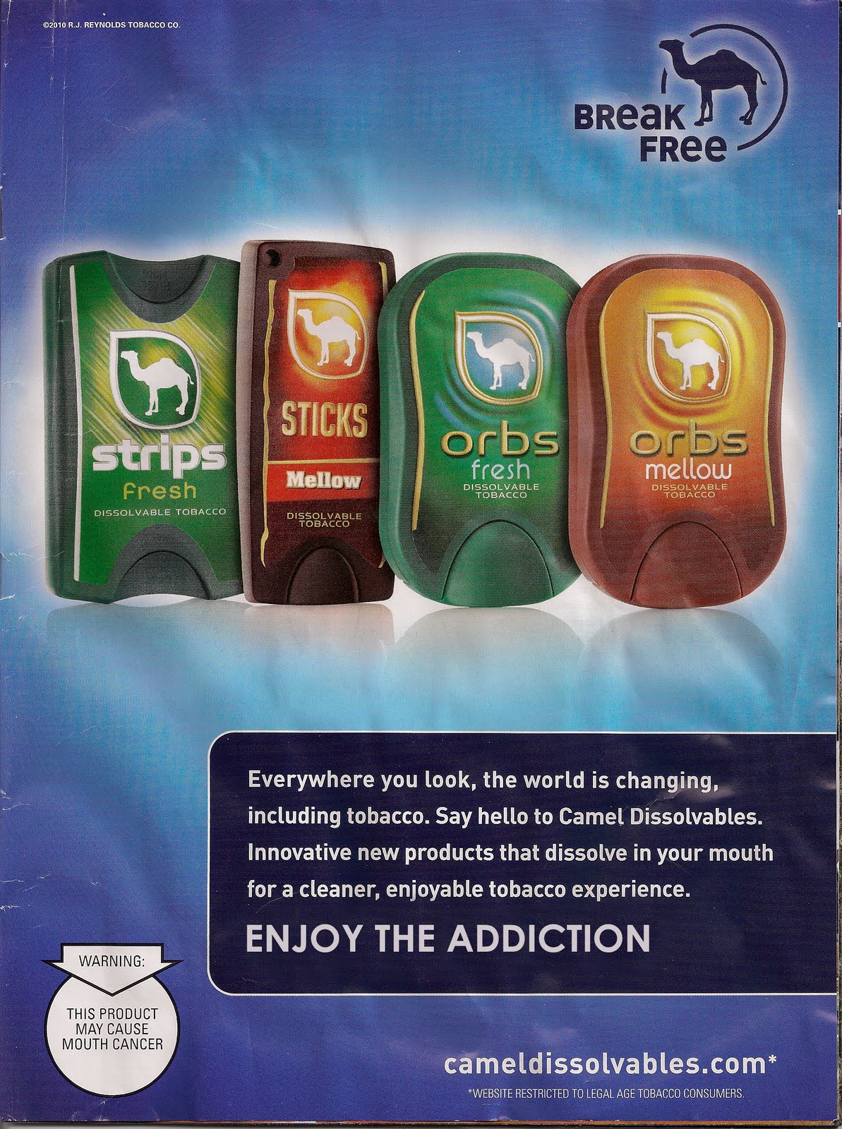
Photoshopped
This ad was ran in the January 2010 issue of Sports Illustrated. The ad is selling camel cigarettes. The overall layout of the ad is very simple but in my opinion very visually appealing with the color scheme. The camel is a huge part of the ad because that is camel's marquee logo. It is recognized by everyone and is key to the advertisement here so that people instantly recognize the brand. The meaning behind the ad is to buy the "new, dissolvable, cleaner" cigarettes. Those are key words used in the ad because of the dangers that people are aware of when smoking cigarettes. When people see the word 'new' they immediately assume their was a new technological breakthrough and it never really crosses their mind to think it could be the same product as before but just marketed differently. Then people see the word 'dissolvable' which may make them feel safer about their smoking experience. Lastly they see the word 'cleaner'. Cigarettes are notoriously bad for your health, but "hey, since it's new technology maybe smoking is safe again" [that's the consumer talking]. People see all this in the ad and it makes the cigarette much more appealing and marketable. The hidden meaning behind the ad is that they want you to buy it and get addicted to it to buy more. It may be sad, but it's true. No matter what cigarette companies do to make their cigarette's 'cleaner' or 'newer' they will still have nicotine in them, which means people will keep coming back for more. The audience viewing the ad could be a wide range of people but mainly men between the ages of 18 and 50 because it is in a Sports Illustrated magazine. Also, I'm fairly certain the slogan at the beginning of the text at the bottom of the ad, 'the world is changing, including tabacco' was not used on accident with Obama's election campaign being about change (I could be wrong). I think for the reasoning behind the key words in the ad that I just explained the ad is trying to target responsible people who still enjoy smoking. They are trying to turn smoking into something that may not be harmful to your body anymore. The ad has a youthful vibe to it but they're aren't any clear distinctions on who the ad was targeting as far as gender, ethnicity, race, class, sexuality, etc. The text in the upper right hand corner simply says, 'break free'. Much like the Victoria Secret ad I think this is promoting a casual more care free and chill lifestyle that is popular among my generation so in some ways you can argue the ad is slightly biased towards the twenty something readers. The ad indirectly says that by smoking you will break free and become cool in a sense. I think the ad is very effective. It's aesthetically pleasing and you immediately see the words fresh, mellow and enjoyable. Despite my knowledge of the danger of cigarettes the ad makes you forget about the health risks for a little bit. In conclusion, the ads hidden meaning is that the producers want you to think that by smoking you will attain a mellow fun lifestyle and hopefully you become addicted to their product, which is the reasoning for my alteration.
[Props to Joe Maleski for the Photoshop help]

Michelle Anderson
I chose this piece because I liked the uniformity of the body and the way it was made up of dozens of smaller squares to make the larger picture. This piece had all the elemental aspects of art including an impressive use of value and shading using a charcoal medium. Like I said earlier, it was aesthetically pleasing to me because of the way it was laid out with the smaller pictures made into a larger one. Michelle said she was slightly obsessed with the human body and its form. She does dance which has contributed to her fascination. She also said she likes to work with larger pieces because you become a part of the art.

Vedrana Misanovic
I chose this piece mainly because of the strong aesthetic values it holds with the bright colors and the palm tree silhouette. It reminded me of the beach which is always good memories. This piece had all the elemental aspects including really cool texture with the sky and the palm trees. Vedrana said the piece had a heavy California influence to it. She said a lot of her work uses non-objective colors. Her theory for design is to make things as simple as possible.
The pieces were different in the fact that Vedrana's used non-objective colors whereas Michelle's was black and white. They were similar in the fact that they both used stark contrast in colors to create defined lines.
Saturday, May 8, 2010

Elizabeth Cramer
Memoirs from Home Series
I chose this particular piece strictly because of the aesthetic appeal of the beach scene. For the past three or four years my family and I have gone to Myrtle Beach for summer vacation and it just brought back great memories of the walk up to the beach off the boardwalk. This piece possessed all the elements of art. I think the most obvious element was the value aspect. The piece was done completely in black and white due to the fact that Elizabeth said she is still scared to use colors with her painting since she is so new to it. The value of the sky was especially aesthetically pleasing to me. The reasoning behind the work is in the title of the work. They were simply photographs she had taken from home and than put on canvas. She likes black and white because of the stark contrast in color. She also used layering techniques so that the painting has depth.

Elizabeth Cramer
Martini Diver
I chose this piece because I really liked the scene it was portraying and I thought the painting was just really impressive. Again, this piece possessed all the elemental qualities of art and again, the value stuck out to me because it was in black and white. This piece was pleasing to me for the above reasons. Elizabeth said she had a project for class where she had to find ads out of a magazine which is where she got the inspiration for this particular piece. She said it's good to use an image as a jumping off point.
These pieces were similar because of the black and white aspect and the value. They were different because one portrayed a very realistic photograph while the diver had a less nostalgic feel and was just more 'out there'.
Friday, May 7, 2010
Stuart Ewen Quote
I completely agree with Stuart Ewen’s statement that we as humans construct our identities in part through the consumer products that inhabit our lives. Advertising speaks to us in ways that we may not even realize. Growing up we begin to shape ourselves into the human beings we are going to become whether it’s what we have chosen or what someone else has told us to be. The effects of advertising start early on in our lives with television commercials, magazines, billboards and virtually everything that has a picture on it. We may see a person in a magazine using a certain product and we may like how they look with that product, which makes us want to buy that product. We may not even realize the underlying message, which is that in order to be a certain way you must have that product. However, during formative adolescent years of a kid’s life their peers begin defining what it means to be a certain way through material possessions. This makes a lot of teens go out and get certain products to help define themselves and establish the identity that Ewen is talking about in his quote.
I can’t think of a more pertinent example with virtually any rap artist. All they rap about is money, cars, and women that they lured in with there material possessions. Then you read about how they beat their girlfriends. People then wonder why. Maybe because they developed their entire persona around material possessions and never developed moral character. A lot of the blame can be put on the education system and bad parenting, but that’s a whole different issue.
The chapter also talked about the presumption of relevance, which is basically what I touched on earlier about how people feel like by getting a product they will magically become whatever the product is advertising. We see ads and think we can become like the people in them, which is a completely unrealistic idea, but in the ad world it seems feasible to us.
I think in today's world you would have to be completely isolated from the world of advertisement not to be a product of some type of product so in a way I am a product of products. However, I've developed character and personality traits that make me who I am outside of material products as well so I guess I'm a little of both.
Thursday, April 29, 2010

Molly Parker Smith
I chose Molly's piece because it really popped out to me. It wasn't really colorful or shocking so I'm not sure exactly why it popped out at me. It may have been because it looked alive with the way the babies were "rolling" around. The mom figure had a distinct face that kind of drew me in. I feel like the piece possessed all the elements of art except for maybe value. The colors were pretty straightforward. The "animals" in the piece were very soft looking and had two basic colors: red and white so in a way the piece was aesthetically pleasing due to it's simple color scheme and the seemingly innocent scene it portrayed. Ironically, even though the piece was pretty soothing in my opinion, Molly was inspired by her fascination of watching animals, in particular deer, decay. She said her fascination with death and the idea that we don't quite know when it's coming mixed with her vivid imagination sprouted her work. You can't really see it in the picture, but the "babies" have visible rib cages and the mom has a very bone-like spine that she said was also inspired from the deer carcass.

Billy Fry
Again, I'm not completely sure why this piece drew me in, but it did. I can speculate it is because the color scheme, the style of painting, the eyes of the dude in the picture but I'm not completely sure why I found it more interesting than the others. It could have also been the look in the guy's eyes. Very serial killer 'esque, so whether I wanted to look at it or not, it still had a very memorable look that I thought was cool. It's safe to say this painting had all the elemental qualities of art: line, shape, texture, value and color. The piece was very aesthetically pleasing because of the color scheme and the look in the eyes of the guy. This was actually a self portrait of Billy, the artist, himself. When I found out it was a self portrait it scared me that someone looked like that on campus and I feared for my life, but after seeing and hearing Billy I was no longer afraid for two reasons.
1. The drawing did not really look like him and I think it was supposed to be a little overexaggerated which was relieving, and
2. He was a really nice guy who did not seem like a serial killer.
Billy said he wanted it to be shadowy and he liked how the red modeled things. He said the colors: red, white, and blue ironically were not meant to be patriotic but were meant to represent confusion and frustration.
The two works were pretty much completely different in their meaning and layout: one being a painting, the other being an actual 3 dimensional scene. They both used red in their work. Reading the explanations also answers the question of how the works are similar and different.
Subscribe to:
Posts (Atom)